
Climate change is upon us, and it can be difficult to grasp what the consequences are. Data journalists can help the reader understand the immediate and long-term effects by using interactive maps and graphs. Here are five of our favourite data visualisation stories.
The climate disaster is here – The Guardian
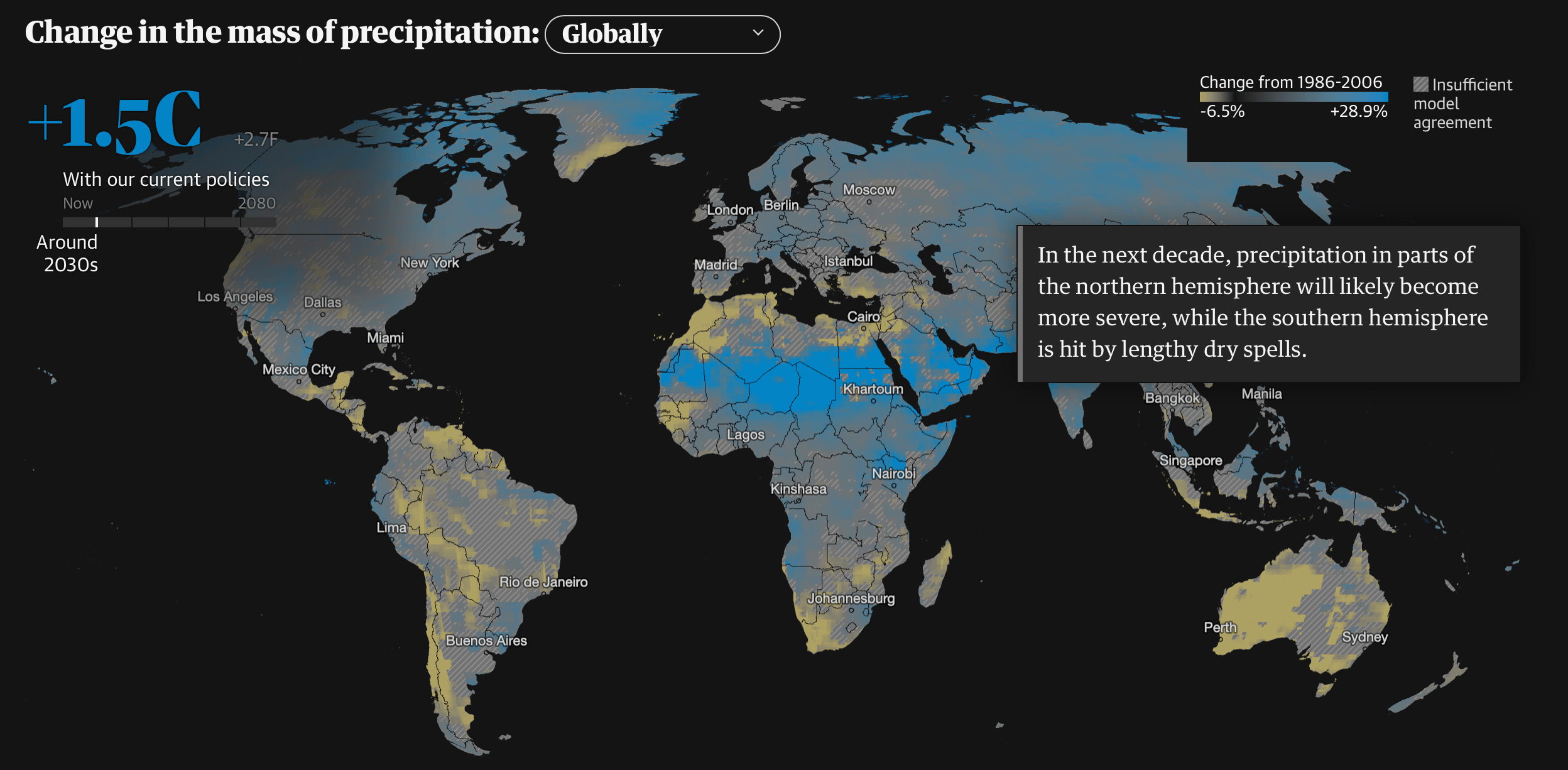
The Guardian explains how four results of climate change (heatwaves, floods, wildfires, and crop failures) will increase in the coming years if our current policies are not changed. It’s a clever way of showing that these so-called ‘once in a lifetime’ events, which all took place this past summer, are only going to occur more frequently.
Read the story here.
America in 2020: The Impact of Extreme Heat, in Maps – The New York Times
This article in the New York Times uses a collection of simple, yet effective, maps to demonstrate how the estimated annual heat-related deaths in the US will change as a result of emission reductions (or lack thereof). An overview of 12 different countries and their dramatically increased average daily temperatures since 1900 is also presented.

Read the story here.
The Chinese Companies Polluting the World More Than Entire Nations – Bloomberg
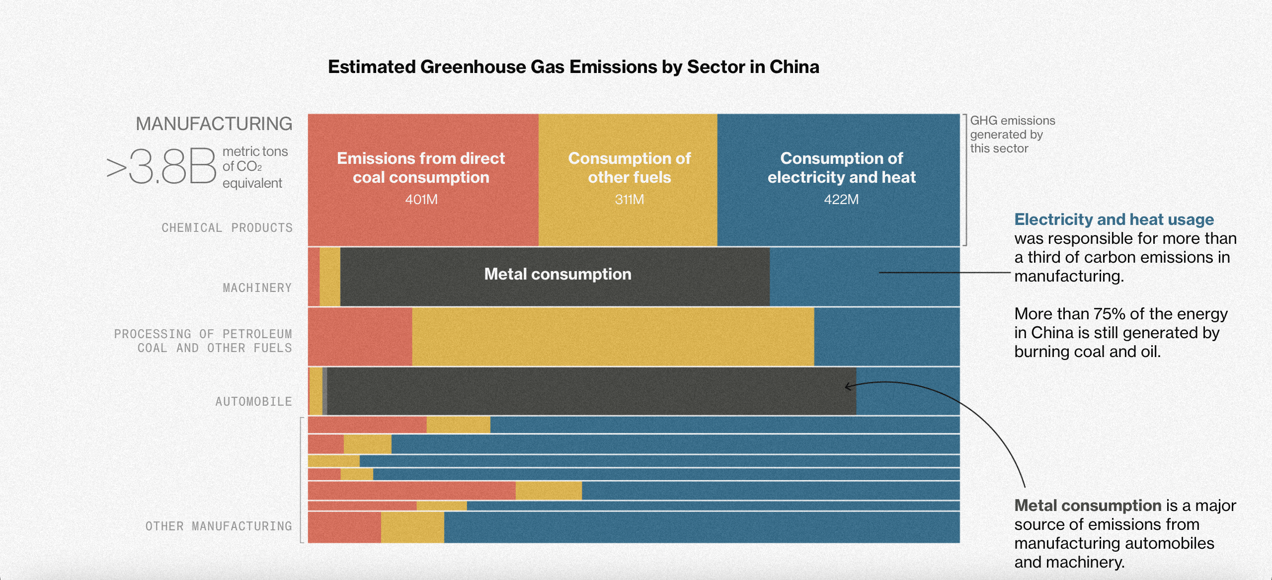
Using moving graphics depicting CO2 particles, as well as clear-cut squares representing the emission output of Chinese companies compared to countries, Bloomberg shows how much China pollutes and what it can do to tame these emitters.
Read the story here.
Down River – Reuters
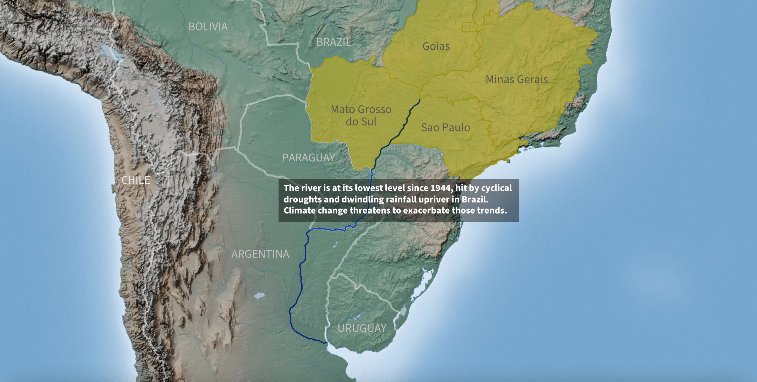
Reuters tells the story of how years of drought as a result of climate change have dropped the Parana River to levels not seen in 77 years. It does so by taking the reader along the course of the river, clearly indicating how much has dried up over time, and explaining how this interrupted energy, commerce, and ecology.
Read the story here.
Climate Graphic of the Week – The Financial Times
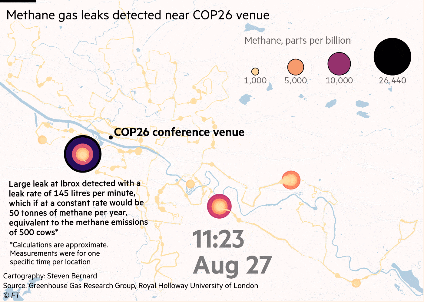
Last but not least is the Financial Times, which provides a new climate graphic every week. A recent story featured the discovery of a methane leak – a powerful greenhouse gas responsible for 40% of the world’s warming over the past decade – near the COP26 venue in Glasgow.
Read the story here.

MA Data Journalism student at City University London