
If you’d never heard of a tracker or a dashboard before the Coronavirus pandemic you certainly will have now. Both national governments and publications have produced their own trackers to varying degrees of success. Interhacktives takes a look at 5 of the most googled Coronavirus trackers.
Financial Times
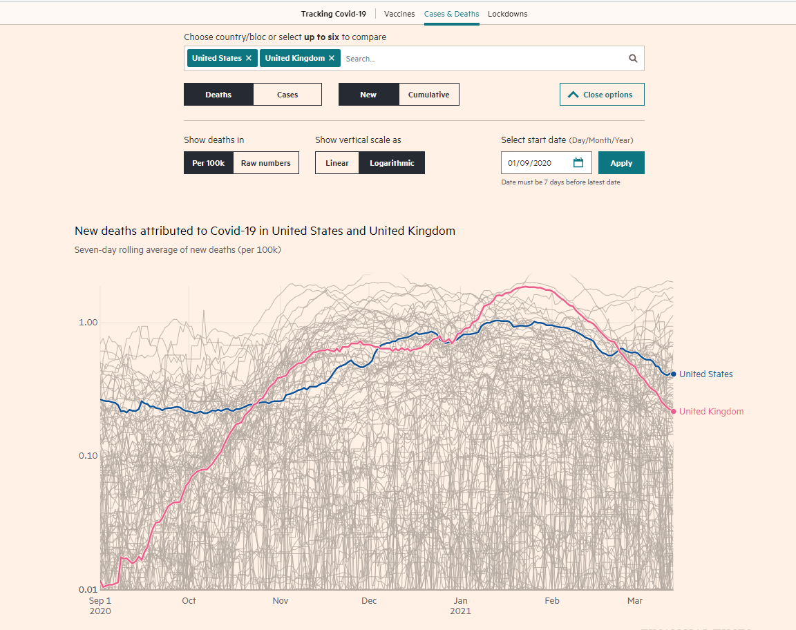
The Financial Times’s tracker started with a chart tweeted out by Interhacktives alumni John Burn Murdoch. It now takes the form of an interactive deaths and cases chart with lots of settings including: Comparison of up to 6 countries, new or cumulative figures, raw numbers of per 100k and linear or logarithmic scales. Recently they’ve also included a vaccines tracker that tracks vaccines doses by first or second dose and by nation.
The FT produces a lot of its backend in R and then creates its charts for print and online using D3.JS with some post-production using Adobe products.
The Guardian
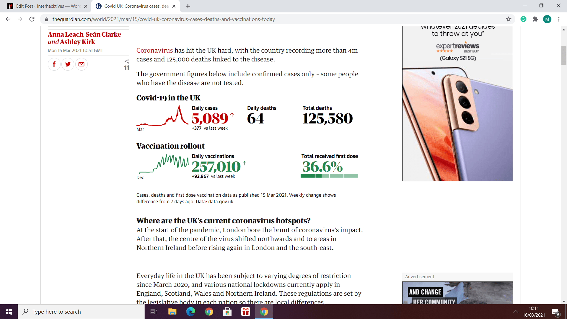
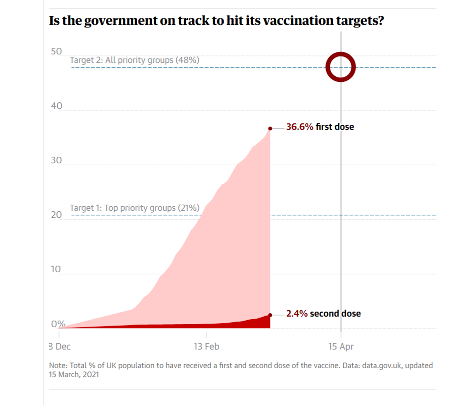
The Guardian has a UK coronavirus tracker that uses colourful bold type to set out the daily cases and deaths data. It has also recently include vaccination data. What sets it out from the crowd is they also include a heatmap with “hotspots” and “on the rise” to graphically show where in the UK has the highest cases of coronavirus and where the virus is increasing or shrinking the fastest. Further down the tracker page, there are also a number of daily charts covering statistics such as Coronavirus hospitalisations. A particularly interesting chart compares the vaccination rollout to government targets.
WHO Disease Dashboard

The World Health Organisation also provide their own data dashboard where you can track global coronavirus data. It covers cases, deaths and vaccinations. There is a lot of information in one page and so that charts can appear cluttered however it’s a great place to view global data the main graphic is a global map so it’s good if you want a geographical representation of the pandemic.
BBC
The BBC’s tracker pushes you towards looking at local data. It uses the SEO friendly headline: “Covid-19 in the UK: How many coronavirus cases are there in your area?”

The main data is presented in an image of 4 charts making it easy to share.

It then presents a postcode search function that offers up local data on cases, deaths and vaccinations.
Data at source (UK Government Dashboard)
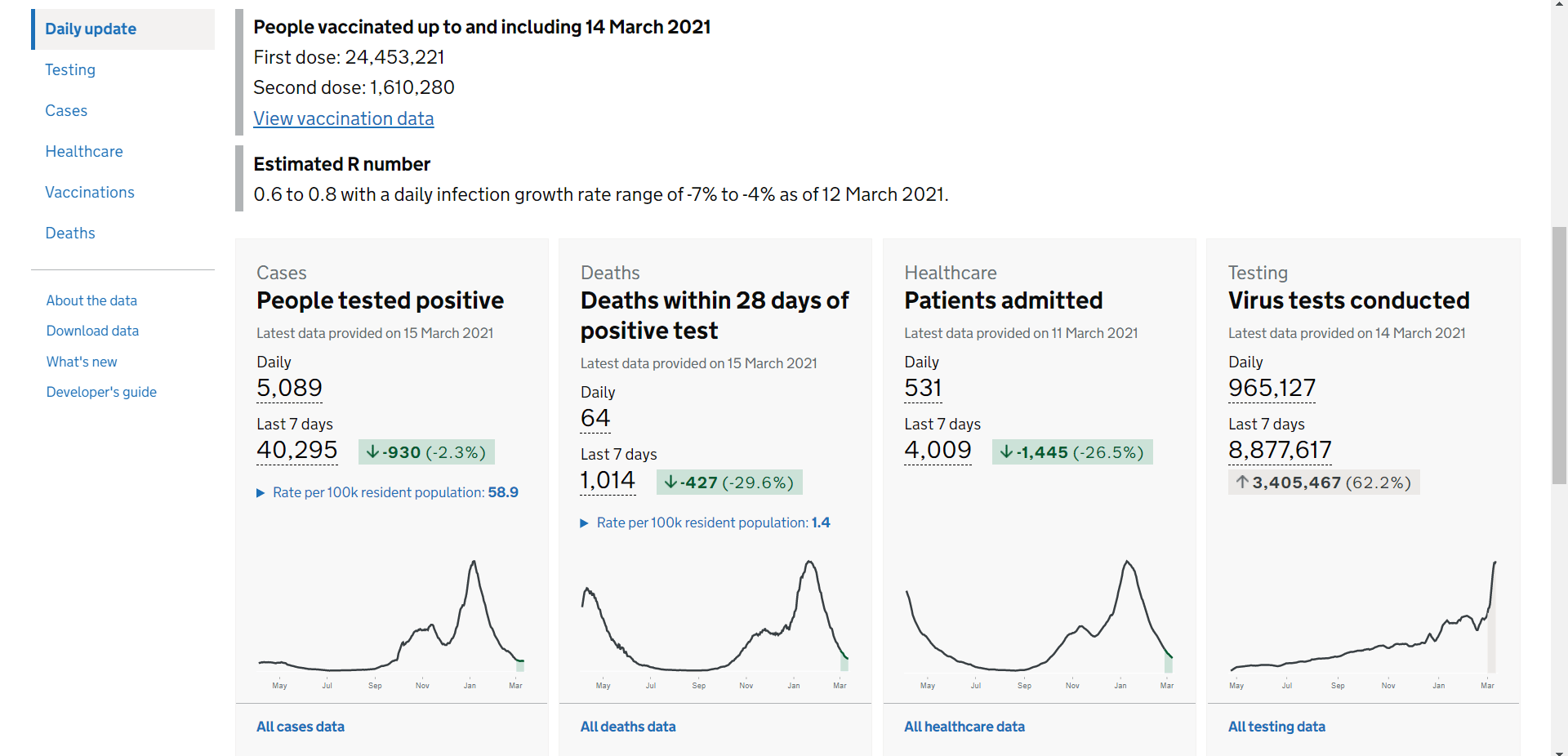
If you want to get UK data directly at source, the UK Government has its own Coronavirus dashboard that Interhacktives have written about previously.