
Datawrapper is an accessible platform used to visualise data, which makes the process of transforming numerical data into visualisations easier. It’s used in many newsrooms, for example this analysis by the Guardian of Michael Bloomberg’s presidential campaign.
Follow the step-by-step tutorial below if you’re new to data journalism and need interactive maps, graphs or tables to showcase your data:
Begin creating your visualisation
Once you’ve logged into Datawrapper, select the visualisation you would like to create from the options above. If you’re looking for specific types of charts, tables or maps, the options further will direct you towards making the right choice.
Here is the FT’s guide to visual charts to aide your decision.

Import your data
No matter what format your data might be in (XLS, CSV etc), Datawrapper works with different formats as shown below. Simply copy-paste or upload your spreadsheet into the white box to begin your visualisation process. Data for a new chart and a new table must be uploaded in a similar way.

However, if you’re working on a map, selecting the type of map is the first step towards visualising data in this form. You can then move on to specify the kind of map you require based on world, continent and country maps. This will then direct you to a similar page to upload your data.

Check and describe your rows and columns
Make sure your data is in the correct row and column for Datawrapper to extract the numbers and display them in the form of visualisation you will select. You can swap your data around if the table doesn’t look the way you expected it to using the ‘transpose’ option shown below. Reminder: check your data at least 3 times before moving on to the next step!

Choose your type of visualisation
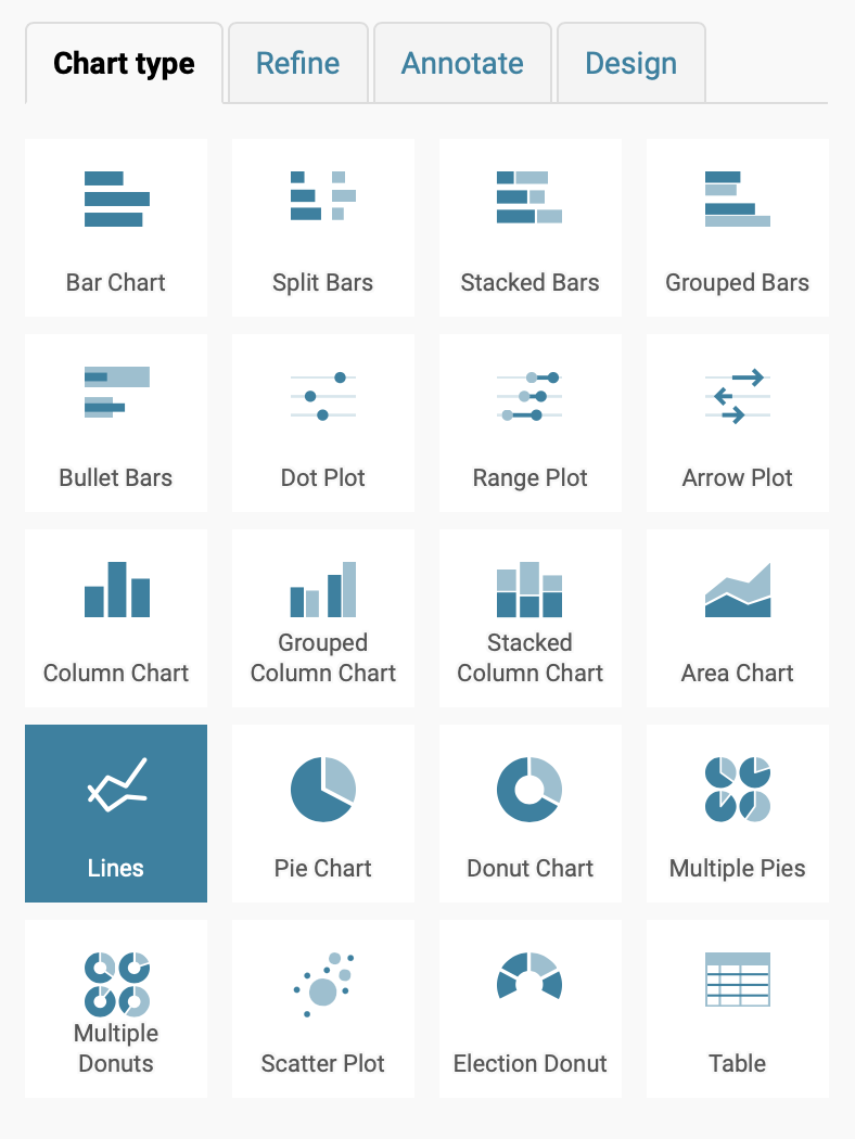
If you’re creating a chart, you will notice a range of options that will help visualise your data in the most accurate manner. A variety of chart types help showcase data in ways that make it extremely easy to understand.
Your data can be highlighted visually in more ways than one. My advice on finding the best type of visualisation is – play around with each type. Being aware of the multiple ways in which your data can be presented only helps you choose the most accurate visualisation for your story.
Refine your visualisation
The tab ‘refine’ next to your chart type is where the magic happens. Simply begin with adjusting your data by customising your axes in the format of your choice. Next, add your labels and play with the colours in front of you to make it look pretty. Don’t forget to add a key if you have chosen to show your data ‘on hover’. This interactive feature shown below enhances the visualisation and the variety of colour schemes to leave you with an attractive interactive data visualisation!

Annotate your visualisation
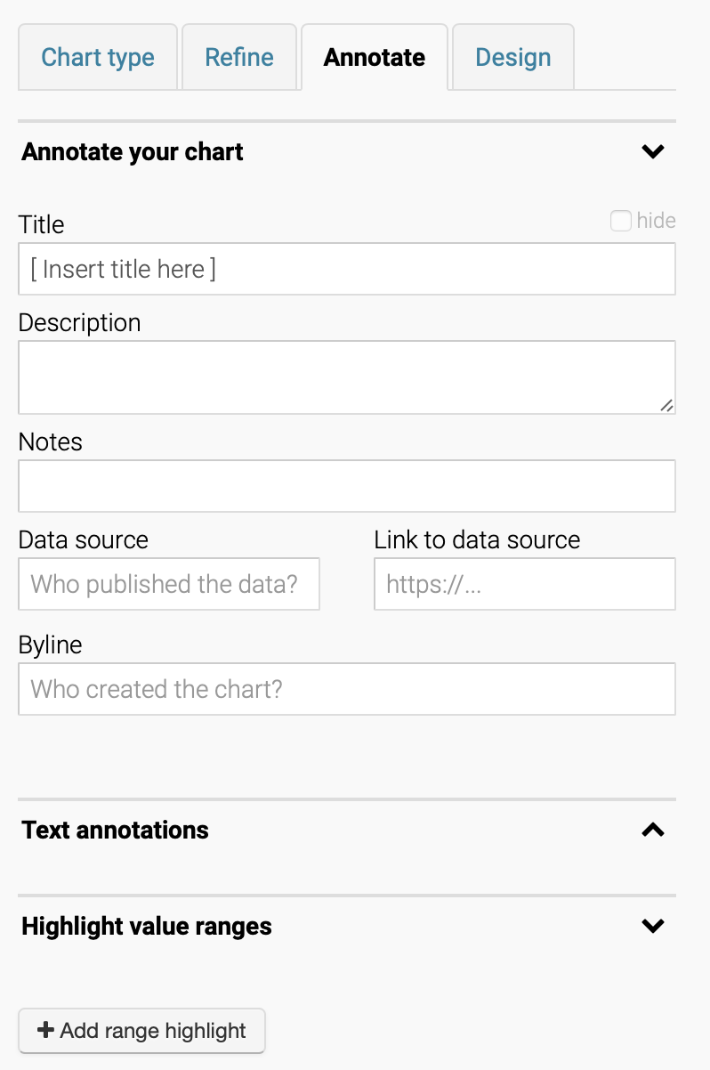
One last step until you have the final version of your data visualisation. The ‘annotate’ tab is where all the descriptive elements for your chart or map will go – with a box for where you extracted your data from. This is particularly useful if at any point after creating your visual, you want to access the original data used by simply clicking on ‘get data’ at the bottom of your published visualisation.
Text annotations help you add keywords anywhere on the chart or map (placed according to your choice) to enhance the understanding of your visual in the eyes of a reader.
Publish your visualisation!
You’ve done it, you’re finally at the final step! It wasn’t as hard as you thought it would be, right?
Click on the little blue box named ‘publish’ under the design tab which will direct you to the final page in Datawrapper. Publishing your visualisation will save it in your charts and give you a shareable link that you can embed in your article (or whatever maybe the use for your visual).

Data visualisation, you might have noticed, helps enhance your work in journalism and simplify the understanding of numerical figures in interactive ways. Hopefully once you’ve given Datawrapper a go following these 7 easy steps, you will have a visualisation that not only makes you happy, but informs your readers in the most appropriate manner.