
Visualising your story is a key aspect of a lot of data journalism. While there are stories that don’t require a visualisation, be it a simple or complex, many more do and getting that right is key for readers and journalists.
I caught up with Cath Levett, Head of Graphics and Interactives at the Guardian Media Group, to find out about their approach to data visualisations, the future, and what they think is important.

The Guardian has a reputation for some of the most visually impressive graphics and data representations out there, with this in mind I asked Cath:
What do you do on a daily basis what are the processes behind how the Guardian go about building their graphics?
“My job has moved very quickly from being a person who does design work physically to being somebody who has ideas and focus on the best way to tell a story. In that way it’s quite nebulus, its all about how we approach things.
“While retaining similar elements the process we go through to create a visualisation will differ every time. We always sit down in a project group, there will be a developer, a designer, another senior editor and a journalist in attendance at least.
“What we try and work out is what is the story and what are we are to tell. Then we sketch out a plan and start designing.”
Cath summed up the process as “being about playing around and aggressive collaboration. If one person tries to do it the result is chaos and nothing gets done.”
What tools do you use to build the Guardian’s visualisation?
“We start with pens and paper and whiteboards. We sketch, sketch over each others work and come up with an idea. Then will use Adobe illustrator or photoshop to render it.
Only at the point we have a good plan do we start building the graphic. We use a variety of tools to do that; D3 is one of the most common tools we use but we also use CSS, JQuery and Javascript libraries for example. We use pretty much anything with Javascript.
“We also use more simple tools depending on the project but a lot of our stuff comes from D3 now.”
What makes good visual journalism?
“Anything can be good visual journalism, be it a rich interactive with photos, an immersive snow fall or could just a simple bar chart that tells the story in one second. It all depends on the story and what you are trying to tell.”
“You should not get confused by saying that a great visualisation is a brilliant technical project, it really is about the right approach for each story. It is all about the reader and better informing them and enhancing journalism
“Things go wrong when they don’t collaborate or aren’t sure what’s going on. Often this is for the right reasons as they’ve come to a project late. Setting aside egos is the key to visualisations really. Recently one of our data team did this huge investigation which took weeks and we decided that the best way to use it was just written into the story rather than a big visualisation. That attitude is really key.”
How do you communicate accuracy of data and statistical variance while still making sure graphics look good?
“Well it is very difficult to communicate these things, it doesn’t really come across my desk if I’m honest.
“But I think it is about who you are aiming to inform. You would have the hurricane paths if you were writing for an economic paper but its different in journalism. It certainly isn’t about dumbing down, instead it is about showing what is key and answering our readers questions.
“We take a lot of pride in our data at the Guardian, we always use the correct data, if it is in any way flawed we won’t touch it and will only go ahead with visuals when have the correct data. This is really important to us, visualisation is as much about good data as great presentation. Otherwise you aren’t telling readers the truth.
“An example of this how we scale data, we don’t. We always just show how it is, that’s the data. You can’t exaggerate to make it exciting because that is just a lie.”
How do you strike a balance between print and online?
“It is difficult, it is fun but it’s definitely a challenge. A good example is that we’ve been building some fantastic interactives for the election, and now the print edition has caught up with the need to do election pull-outs and specials but if we were going to do them separately it’d be very labour intensive.
“Thankfully now we’re working more and more in D3 we can crowbar the visualisations off and put it into print relatively easily, with only minor changes. We do have to condense things much more as we are obviously digita first and online there is much more space, but this is just distilling down and editing out.”
Speak of the election, how did you set out to approach it and visualise it?
“Our priority was to set out for the clearest possible narrative for readers in all out visualisation. We asked our selves what we are we going need to show them. This could be making sure they have access to the day-by-day polling data or what the policies from the different parties are.
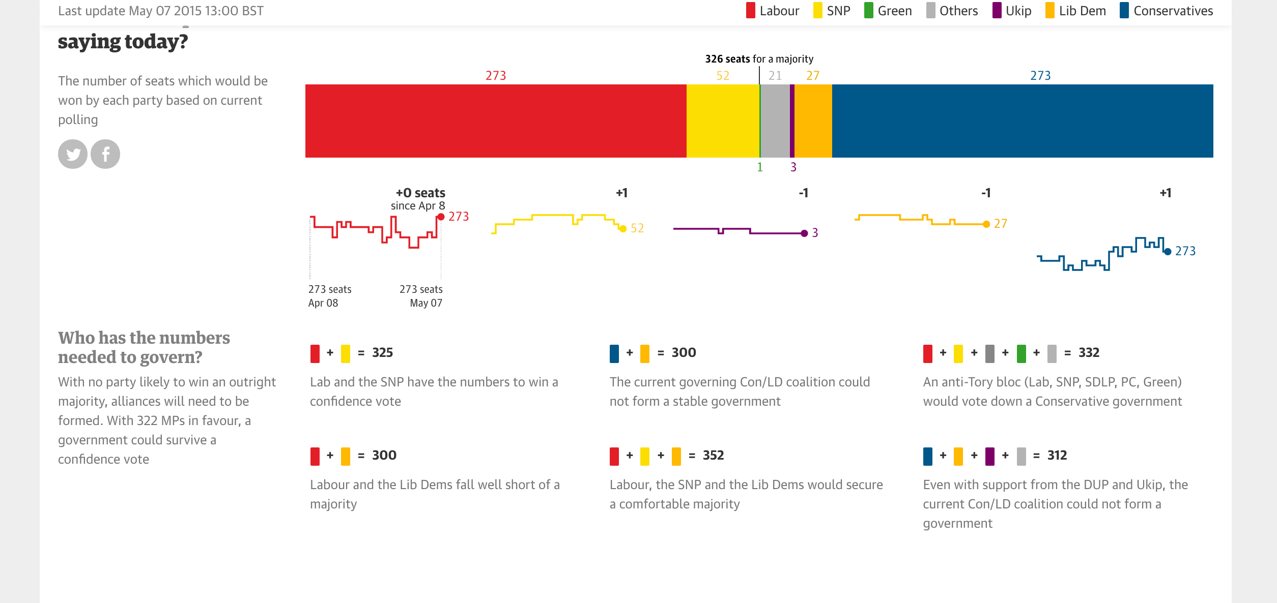
“To this end we had focus groups in and came up with seven or eight key interactives. Probably the best is the Guardian Poll Projection.
“Although it’s a model it is our model and we are very clear about the hierarchy so that solved a lot of problems for us. We put it in D3 again, like a lot of election interactives, which makes it very editable and can be run from a Google spreadsheet polling wise. It is a really good example of how great visualisations are about bringing different peoples expertise together.”
Where going what are the main challenges going forward for data visualisations?
“It is all about making sure put the reader into the story and asking where they fit into the story. Journalism is all about telling the story and that is what we need to keep in mind.
“For example for the World Health Organisation Obesity Index data you could visualise it simply as a map, or you could make it a data set where the reader is involved and they input their data and see what they are in the world. It could be are you fatter than a Samoan or skinner than Ethiopian.
“Or take the Tour de France where you could measure your cycling speed against Chris Froome. This sort of stuff is difficult but its about addressing our key challenge, making sure the readers get the best experience from our visualisations.”
“Our other main challenge is staying abreast of technological change which is still moving very quickly indeed.
Is the future mobile then?
“Yes, it is where 60 per cent of our traffic comes from – more at the weekend.
“We have a mobile first approach, if the visualisations don’t work there then they don’t work. Everything is designed for each mobile breakpoint, portrait and landscape on mobile, small and big tablets. We try and cover all the angles.
“Even now we are designing for the Apple Watch and other wearables which will be a new breakpoint, but to make sure we stay on top we have to keep ahead of the curve.”
That revelation seems the perfect point to stop on and Cath has to go back up to cover the election. I leave with the importance of mobile and keeping readers needs are your key goal firmly stuck in my head, better equipment to visualise my data in the future.