
There appears to be a real appetite for new tools which attempt to make life easier for data journalists.
Ranging from the advanced, like the powerful software for cleaning messy data Open Refine, to the simple interactive chart-maker Datawrapper, a real favourite among the data driven journalism community, data journalists have an arsenal of tools at their disposal.
Another one worth adding to the list is the in-house application that digitally native global economy news website Quartz uses to make charts. It is open source and freely available for anyone to use.
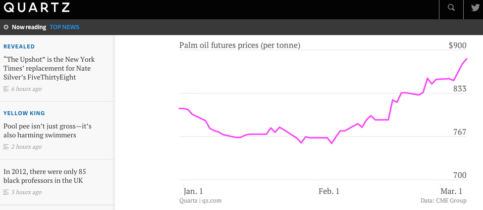
Quartz’s chartbuilder is very much like Datawrapper but without the added level of interactivity, which is actually neither always necessary nor possible, for example for wordpress.com accounts that do not allow embedding charts.
To use the chartbuilder, you simply paste the data into the tool and then pick between bar, column, line and scatter depending on how you want to visualise each data series.
Quartz’s open source chartbuilder is as simple a data journalism tool as they come.

There are fields in the workspace for tweaking things like graph axes and labels, while any change you make is visible as you work.
Perfect for mobile.
I recently used it for a data-analysis of an EU survey on data roaming and found it to be extremely straightforward, while the option to export the chart as a picture file works a charm.
It’s important also to consider Quartz’s focus on mobile optimised content and how a lot of more interactive content does not really work on mobile, whereas more ambitious tools may not work so well on a smaller screen.
Also, for those into their design, you can export the chart as an SVG, open and subsequently edit it in Illustrator.
Quartz initially created the chartbuilder in order to lower the barrier for what they described as “non-technical and less-designerly journalists” to create charts in their own newsroom.
According to the application’s creator, David Yanofsky, the chart-builder “has helped all of our reporters and editors become more responsible for their own content and less dependent on others with specialized graphics skills”.
And opening it up to the rest of the world will hopefully see journalists elsewhere become more responsible for the data and visual content that accompany their articles.