
Nicolas Belmonte tells Interhacktives what being a Data Scientist at Twitter involves, and what advice he would give to aspiring data journalists.
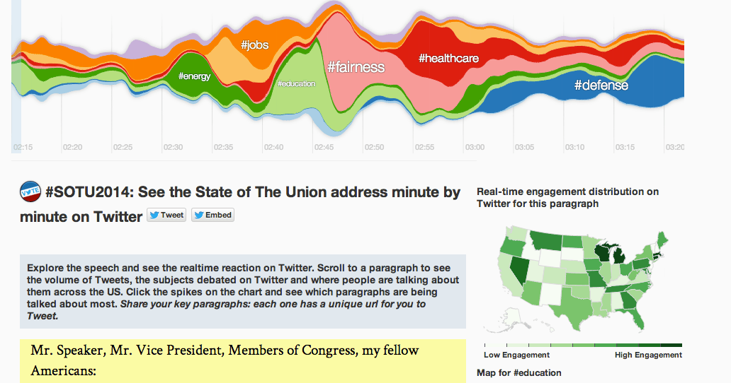
When Barack Obama presented his State of Union speech earlier this year, Nicolas Belmonte and The Guardian’s former datablog editor Simon Rogers created a data visualisation that showed Twitter users’ responses to the speech, such as by subject, in real time. Interhacktives asked Nicolas Belmonte how he created visualisations like this and what his tips are for journalists that want to become more like “data scientists”.
For pieces like your data visualisation about reactions on Twitter to the State of Union speech, can you briefly explain how you analyse the sentiment of each tweet?
We classify tweets into topics and also measured engagement on Twitter during the State of the Union address. For the topic extraction, the Twitter Government team provided us with a list of keywords grouped by topic. For example, the words “jobs” and “employment” fall under the topic “jobs”; “Education”, “Schools”, and “College” fall under the topic “education”, and so on. We mined the text of the tweets sent during each paragraph of the State of the Union address to extract the topics being mentioned the most at that moment. For the state-by-state engagement we measure the volume of Tweets relative to the users in each state. This gives us enough information to populate a Choropleth map.
How long do visualisations like this take? What different software or tools do you use to create them?
We started working on this visualisation about four weeks before the SOTU address. We prototyped different visualizations, worked with data from the 2013 SOTU address, iterated and got the final piece at 2am the next day of the address. We used D3 and JavaScript InfoVis Toolkit for the visualization side.
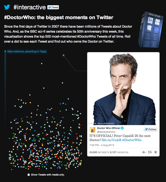 I noticed that in your Doctor Who piece you used Topsy. Do you regularly use third party services for your own visualisations and if so, why?
We use both third party analytics tools and also in-house tools. Each tool has its tradeoffs: whether you can get your data quickly, whether the information is very accurate or only approximate, whether other metrics are used to complement the engagement metric that are outside the Twitter scope, etc.
What tools would you recommend that trainee data journalists learn?
Andy Kirk has an excellent resources page with a long list of Tools for you to try out. Some of them don’t need coding skills, others do. For data visualization I mostly use tools I made myself, like JavaScript InfoVis Toolkit and PhiloGL, but also use other very handy libraries like D3.js, Chroma.js, Three.js and do quick data analysis with R.
What does a data scientist actually do?
Most data scientists use machine learning algorithms to get insights from big data. Things like clustering, classification, topic modeling, regression, etc. all fall into “data science”. At the visual-insights team we work closely with data scientists to provide tools for visual exploratory analysis. We also work with the comms, media and government teams to do expository visualizations of data that show how people on Twitter react to big events. This is why we built #interactive, home page for our public-facing Twitter data visualizations.
In what ways are the Twitter data team experimenting with data? Would you describe Twitter as being innovative with data?
The Twitter data team is mostly a cross-functional effort between the visual insights, comms, media and government teams. Each of these teams has its own way of looking at data. On this collaboration the visual insights team role is to present the information related to these topics in interesting ways. “Interesting” may vary per topic and visualization: we might focus on something insightful, playful, exploratory, storytelling, etc.