
“And outside the window was like a map, except it was in 3 dimensions and it was life-size because it was the thing it was a map of.”
Author Mark Haddon was describing a fictional scene, but he could just as easily have been portraying the complex weave of social networks we all inhabit. Thanks to applications like LinkedIn’s mapping tool (below), we can visualise the web of contacts we’ve gained through our employment; our education; even our friendship groups.
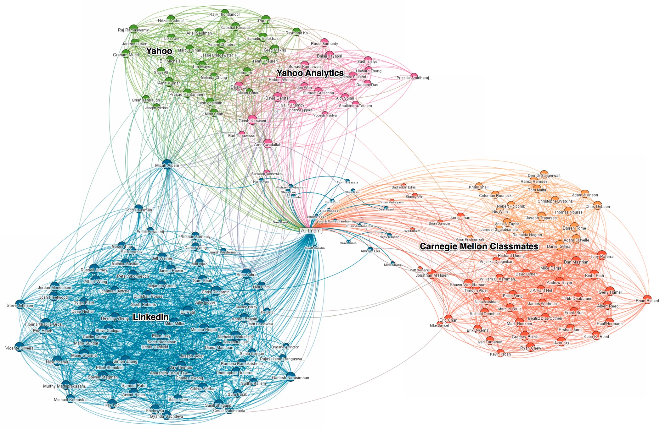
It’s a fantastically engrossing tool, even if it’s not particularly useful. While the maps might occasionally reveal that two of your contacts are also in contact with each other without your knowledge – shock horror! – they’re generally glacial in how quickly they change, because they’re you-centric.
So a social media application that creates the map for a particular event would be incredibly handy. You’d see who at the event was the most influential, and who was lurking at the periphery. Luckily, such a tool exists, even if it’s in a prototypical, experimental stage at the moment – the RSVP Project.
Developed in part by the Daily Telegraph’s Dan Palmer, who provided the code, the RSVP Project provides a social media map of everyone attending a particular event. Their size and placement within the map is based on four main criteria: their connections to other people at the event; their Klout score; their tweeting rate; and the amount of followers they have. The qualifications are relatively arbitrary, since there are simply so many criteria for judging a person’s influence online, but nevertheless the project is a fantastic way of instancing the relationships between event attendees.
Intrigued, Interhacktives asked Dan Palmer about the project, his philosophy regarding coding and what he sees as the future of journalism:
Which of the projects you’ve worked on for the Telegraph do you consider to be the most valuable for demonstrating the potential of data journalism?
“School league tables. The main functionality of the tool is to help parents find a suitable school in their area for their child. However it is also a very big dataset that makes it great for comparing and finding schools. What we don’t have at the moment is an easy way for the user to see how the schools have changed over the years. Being able to compare but also explore in an easy and visual way is important. However that doesn’t say we’re not thinking about it every time the school data is released.”
Were infographics something you’ve always been interested in, or were you asked to start thinking about them when you began working for the Telegraph?
“It wasn’t something I had thought about till I was given the job. Nearing the end of primary school I had dabbled in coding but struggled to find suitable projects to keep me going. It wasn’t till university where for a final project I was able to code a twitterwall displaying popular words relating to the event. From there I was hired at the Telegraph to work on interactive graphics. Initially I didn’t think I would have been that interested but after doing projects like yearly school league tables and the olympics, I’m finding it quite exciting looking through some of the data. Currently when I have some downtime at work, I’m finding myself going through football data and working with a designer to try out different visual ideas which is really nice.”
The RSVP Project is a fantastic example of what we at the Interhacktives consider to be the future of tools to aid journalists – how did you come to get involved in it? Is it an experiment you think is worth repeating?
“With this project, I was luckily to have been approached by a friend from university who had attended a hackathon. We had worked previously on other projects and have always got on well. He would do the design side whilst I would code. I thought it was a great idea as it can be fascinating to see who potentially know who at events taking into account the six degrees of separation theory. I can see the idea of this visualation/network maps as a helpful and visual tool in data journalism for mapping out connections between people such as MPs or the hierachy structure of a business.”
What advice would you give to an aspiring data journalist?
“If you’re passing on your data to someone else, make sure they fully understand it. There are still times where I’m given things and they completely go over my head. This also applies for the other way around. If you’re given data and are unsure, there is no harm asking about it. Questioning could lead to different angles you didn’t initially see.”

Chris M Sutcliffe is a trainee journalist at City University London, specialising in data and online journalism. He's also a webcomic artist and writer, but we try not to talk about that.