
I decided to experiment with Google Fusion Tables after my past Google Heatmap attempts, and create a map which was much more interactive.
I submitted Freedom of Information requests to the Department of Health and other governmental organisations for information on cancer rates by primary care trust (PCT) or other suitable boundary, either as a whole or per 100,000 people.
The Health and Social Care Information Centre (HSCIC) directed me to their cancer data within their data portal, where it was possible to find a breakdown of all cancers by PCT (the latest data being 2011). I uploaded the data onto a Google spreadsheet and created a Fusion Table by selecting the option from Google’s applications menu. I then selected the columns of data I wanted to map and created the map. Under Map of Col 2 > Change map styles, I was able to fiddle with the ‘buckets’ or decimal boundaries which decide the colour of the icons according to their value. I custom-selected the bucket values as the lowest number is 0.6 and the highest 2.8, so they weren’t ascending in whole numbers.
Within the map it is possible to click on the map icons and see a summary of which PCT is located, and what the percentage of cancer prevalence per PCT is. The largest icons represent the highest percentage of cancer prevalence per PCT, and then the coloured icons denote a decreased percentage of cancer prevalence per PCT by blue, red, pink and green respectively.
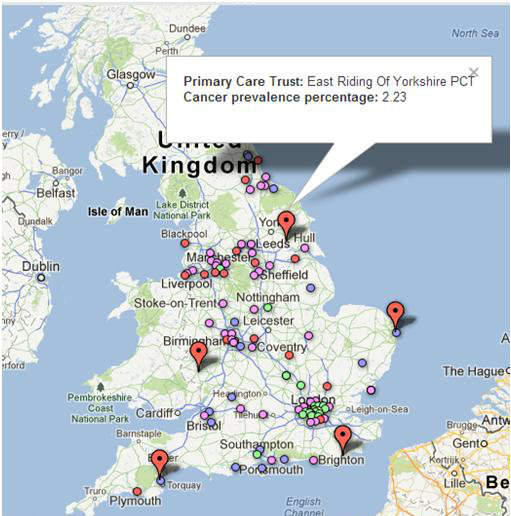
From the map we can see that the highest cancer prevalence PCTs are East Riding of Yorkshire PCT (2.23%), East Sussex Downs and Weald PCT (2.08%), Torbay care trust (2.07%), Herefordshire (2.07%), Great Yarmouth and Waveney PCT (2.03%) and Northumberland care trust (2.01%).
The lowest cancer prevalence PCTs are eight London PCTs including Southwark (0.89%) and Lambeth PCT (0.98%), as well as Luton PCT (1.07%), Manchester PCT (1.08%) and Milton Keynes (1.17%).
There could be many reasons why cancer seems so prevalent in some areas and not so in others. The highest prevalence PCTs could be situated on or near industrial or waste plants, although this does not account for the higher pollution-level PCTs of big-city Manchester and London having a lower prevalence. It could be the case that those in lower-prevalence PCTs are encouraged to come forward and are diagnosed sooner, while those in higher-prevalence PCTs are not, and overall the cancer care could simply be better in London, Manchester and Luton (although reports have stated that London’s cancer care is the worst in the country). The London boroughs could also have been gearing up for the 2012 Olympics and increasing sport and health awareness.
Further research into these issues could progress this story further, but even on its own the interactive serves as an insight into cancer prevalence in England.