
Yesterday the final results were in for Thursday’s 2013 council elections, and true to form some of the biggest media publications were not content with simply stating by numbers which councils had won or lost seats (à la the less than inspiring Independent and Spectator’s election results run-downs).
Ignoring paywalled websites and those who simply don’t “do” data journalism, the three biggest sites with noteworthy election data coverage were, unsurprisingly, the Guardian, the Telegraph and the BBC. But who came out on top this time around? Here’s my breakdown…
The Guardian
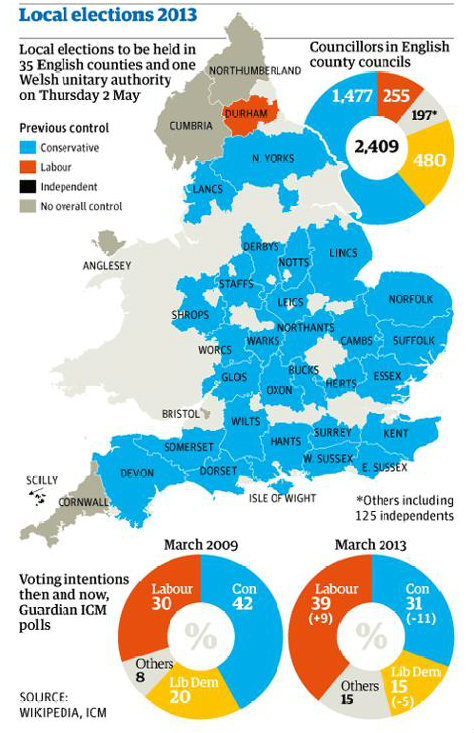
Ever keen, on the day of voting the Guardian posted a graphic highlighting which councils were holding elections, which parties had control in which counties and what the estimated voting intentions were. Good to get the ball rolling, Guardian…
As soon as the election results were in the Guardian published them in table form, including which councils had which seats and which had overall control. In accordance with their open data ethos, all the data was available to download.

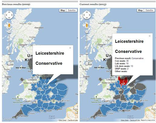
After the results were in, the data team used Google Fusion Tables to create an interactive map in which users can click on different county councils and see which party has overall control of which, and which councils have gained and lost seats. Users can also compare with an interactive map of the last council elections in 2009.
They also produced their own analysis of how many seats UKIP indirectly cost the Conservatives, on top of those they’d outright won.
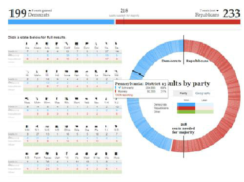
If I’m honest, with the Guardian being the data stalwarts that they are, I was slightly disappointed that this is all they had come up with visualisation-wise . During the 2012 Presidential elections the Guardian had a field day and published some excellent data stories including a hugely detailed interactive map of presidential votes which was clickable by state, and an interactive donut graph with breakdowns of individual state seat votes for the House of Representatives.
Knowing the Guardian, however, and knowing that some data visualisations take longer to produce than others, they may well be cooking something up to release in the next couple of days…
The Telegraph
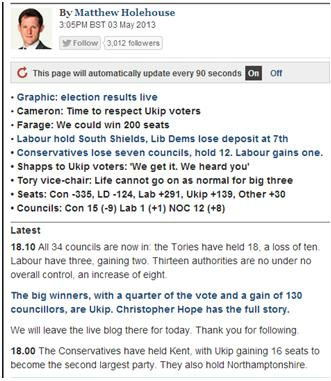
The Telegraph is rapidly carving a reputation as a serious player in the data journalism field, and I’d go as far as to say it trumps the Guardian on this occasion in its 2013 local election representation. In many respects its final results map is identical to the Guardian’s, and it looks like they’ve used the same Google Fusion tools to create it.

What I like about the Telegraph’s visualisation, however, is that I can see straight away who won what, and I like being able to see the overall country-wide winners and losers, as shown in the right hand panel.
While the scroll bar is slightly aesthetically crude, it’s useful to see in one glance which council won what, and whether its majority had changed, and individual readers may want to scroll quickly to their own council. The ‘time’ column which shows when the results came in is a nice touch and adds to the real-time reporting and live-blogging the Telegraph has become so fond of.
As with the Guardian, I’d like to see slightly more innovative data coverage of the local elections; an interesting one would be an interactive map of where the UKIP voters have come from and in which councils they have taken seats from the Conservatives.
The BBC
As I anticipated, the BBC’s election data coverage is nonpareil. I was very excited about their 2010 election coverage and knew there would be no half-hearted attempts for the 2013 local elections.
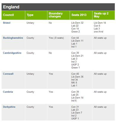
In the run-up to the elections they’d produced an exhaustive table of councils, types, boundary changes and seats, with full details below as to the differences between unitary and county councils, and guides to abbreviations.
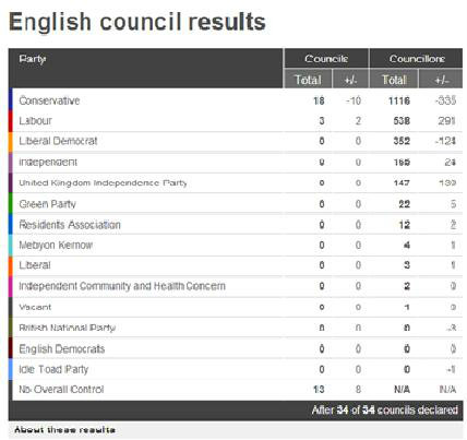
Within the Vote 2013 subsection of the site there is a simple but effective overall results table with added detail of all individual parties.
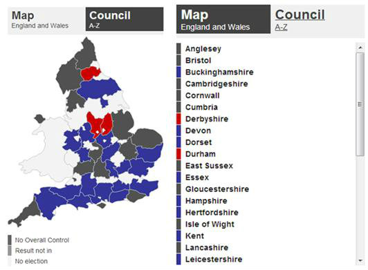
There is an accompanying map, again with suspected use of Google Fusion Tables, but incorporating the best of the Guardian and of the Telegraph’s versions, the BBC has built the interactive so users can decide if they would like a map view or a scrollable table view of the full council listings.
Within the ‘Find a Council’ drop down menu users can select the council of their choice to examine in more detail, with graphics, tables and bar charts visualising that council’s seats and history. The map segment on the right hand side is clickable so users can ‘move’ around the country by clicking on the county next door.

The BBC also situated their results data within their overall Vote 2013 coverage, so the data and interactive directly linked with the top stories and live blog, creating a very cohesive overall package.

I’m admittedly biased as the Telegraph and Guardian aren’t broadcasters, but the BBC’s broadcast election coverage, especially their use of televised 3D graphics, is particularly innovative and successful in conveying the results effectively. I would suggest the BBC’s televised election results are perhaps the first uses of ‘broadcast data journalism’.

As Jeremy Vine explains in the amazing behind the scenes video How do the BBC’s on-screen graphics work?, the team uses green screen technology and special cameras to create a graphic which moves with the camera and presenter, and which the presenter can move both in front of and behind.
“Crucially”, Vine says, “it hopefully allows us to explain the politics of the night. We’re just trying to work out: ‘What are the numbers saying to us? How can we analyse them to make it clear for you?’”
Result
While its rivals usually pale in comparison, the Guardian’s data coverage of the 2013 local elections hasn’t been enormously inspiring, but, like the Telegraph, it’s done a good enough job of using maps and an interactive table to tell the story of the election results. The BBC’s data coverage, however, was slick, comprehensive and accessible.
The ballots are in and the votes have been counted: the BBC still retain their ‘overall control’ of UK politics data coverage.
[EDIT: Par about the Guardian’s UKIP analysis added at 22.04 05/05/13]
Thanks, good piece. However… All the data you mention focuses on seats and councils won and lost. With only 31% of voters turning out, it would be great to see how many votes each party attracted and how this compares with recent elections. I suspect that UKIP (the “big story”) may have polled no more than 1m votes, but I have no evidence for that as none seems to be available. I’d really appreciate being pointed in the right direction as none of the sources you mention above seems to have collected or analysed the voter data as opposed to the seat or council data. Seems both important and elementary to me.