
I decided to experiment with Google Spreadsheet’s Heatmap gadget to visualise some basic global data. Using the UNDOC (United Nations Office for Drugs and Crime) World Drug Report 2012 and accompanying spreadsheet of data, I transferred the data to my own Google document, highlighted the columns of data I wanted to map, and selected Insert > Map. I deliberately chose purple and orange to symbolise the least prevalent and most prevalent drug use instead of the mandatory green and red, because it aids users who are colourblind and so find visualisations difficult to decipher.
The Heatmaps visualise annual drug prevalence of use as a percentage of the population aged 15-64 by country for cannabis, opiates, amphetamines, ecstasy and cocaine respectively. Although the report was produced in 2012, the most recent data it uses is from 2010.
In the following Heatmaps, purple symbolises least prevalent, (with the darker the purple, the least prevalent) and orange symbolises most prevalent (with the darker the orange, the most prevalent). Countries which are white are either somewhere in the middle or there is no available data for them from the report. Unfortunately, in the dataset provided many countries are unaccounted for, and it would have been better to get a clearer overall image of global drug prevalence. UNDOC themselves acknowledge the lack of data, which is particularly acute in Africa and parts of Asia, and they state that “aspects such as prices and purity of drugs, seizures and trafficking patterns and methodological difficulties in estimating in some regions the illicit production of substances make it difficult to analyse and present a complete picture of the…drug market”.
In this post, the links provided are to the actual interactive maps while I have also provided images of them.
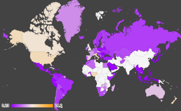
From the map it is clear that cannabis use is least prevalent in Indonesia, some parts of Eastern Europe and central America, but is most prevalent in Italy, New Zealand and Nigeria. UNDOC state that Europe is the world’s biggest market for cannabis and that “most European Union member States report [that] the cultivation of cannabis herb is a phenomenon that appears to be on the increase” and that experts from West and Central Africa report cannabis use to be on the increase.
Link to interactive
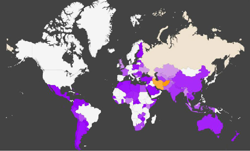
Iran and Afghanistan are undoubtedly the countries with most prevalent opiate use from this map. UNDOC notes that although global opium prices have stalled at 2009 levels, “in major opium-producing countries as Afghanistan and Myanmar… despite an increase in opium production, farm-gate prices continued to rise in 2010 and 2011”.
Link to interactive
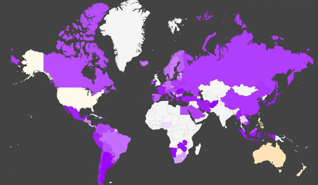
Amphetamine, the second most consumed drug globally, is most prevalent on this map in El Salvador, Australia, New Zealand and the Philippines, which ties in with UNDOC’s statement that countries in Oceania, North America and Central America see the most prevalent amphetamine use.
Link to interactive
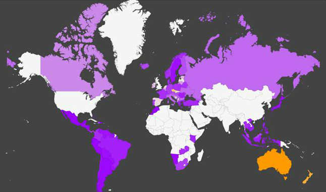
Again, countries in Oceania such as Australia, New Zealand and Tasmania are the most prevalent countries, this time for ecstasy use. The Czech Republic is also strikingly high in its prevalence on the map. UNDOC says: “Globally, the annual prevalence of ‘ecstasy’ use is estimated at 0.2-0.6 per cent of the population aged 15-64 (between 10.5 million and 28 million users) but higher rates were reported in Oceania (2.9 per cent), North America (0.9 per cent) and Western and Central Europe (0.8 per cent)”. It does not, however, mention the Czech Republic specifically.
Link to interactive
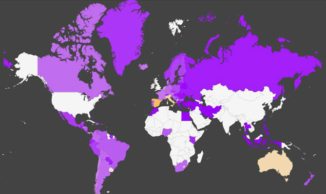
From the Heatmap, the most prevalent cocaine users are in Spain, Italy and the rest of Europe, with Oceana following closely behind. UNDOC states that while cocaine use in America has declined, in Europe it has increased: “The decline in seizures in Europe, despite the apparent stability of the region’s cocaine supply, implies that a change in trafficking modes is occurring as traffickers may be making increasing use of containers”. They also noted that prices in Europe hadn’t changed, while in America they had increased since 2007.
Link to interactive
The Google Heatmap gadget is lacking for several reasons. It doesn’t name the countries when you click on them and within Google Spreadsheet itself, you can only map or chart data in columns which are next to one another, which makes the process very fiddly. There is also no option to zoom into the interactive once it is complete.
That said, the gadget is only designed for very quick visualisations, so I’ll be experimenting with more advanced data mapping tools, such as Google Fusion Tables, next time.