
Compared with online data visualisation tools such as Flourish or Datawrapper, ggplot2, part of the Tidyverse collection of R packages, provides more freedom and customisation options. The BBC Data and Visualisation Journalism team used it to analyse complex data and create publication-ready visualisations.
However, they soon found out that every time they wanted to create a chart they had to retype every individual element and argument to convert the default ggplot style to in-house BBC style. Thus, they developed their own package to meet the needs of the team and keep the workflow simple.
The BBplot package and the R Cookbook style guide were released in 2019 to allow people to create their own charts with the BBC style.

How does bbplot work?
Here is a quick tutorial on what you can customise beyond the default settings:
Getting Started: Install bbplot in your RStudio project
Read more: Learn to visualise in under a minute
There are a few steps you need to do before starting visualising in BBC style.
Install devtools to download and install BBplot from Github
install.packages('devtools')
devtools::install_github('bbc/bbplot')
Load the packages you need for the plot
if(!require(pacman))install.packages("pacman")

pacman::p_load('dplyr', 'tidyr', 'gapminder',
               'ggplot2',  'ggalt',
               'forcats', 'R.utils', 'png',
               'grid', 'ggpubr', 'scales',
               'bbplot')
Import your data and make a plot with ggplot2
This is an example that uses data from the Home office:
#using Tidyverse and ggplot2 to create a graph

ggplot(data= by_year, aes(x=year, y=total, group=1))+
  geom_line()

#create bar chart

ggplot(data=by_year, aes(x=year, y=total))+
  geom_bar(stat="identity", fill= "#2cbba4")+
  labs(title = "Terrorism arrests by year",
       subtitle = "Home Office Data") +
  geom_text(aes(label = total), vjust= 1.6, color= "white", size = 4)+
  theme_minimal()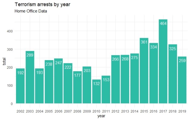
Create BBC style graphics
This is the basic way to use bbc_style(), using the data from above:
My_BBC_Chart <- ggplot(data=by_year, aes(x=year, y=total))+
  geom_bar(stat="identity", fill= "#2cbba4")+
  bbc_style()
If you want to make any additions or changes to the style, you can add additional theme arguments in your ggplot chain after bbc_style():
My_BBC_Chart <- ggplot(data=by_year, aes(x=year, y=total))+
  geom_bar(stat="identity", fill= "#2cbba4")+
  bbc_style()+
  labs(title = "Terrorism arrests by year",
       subtitle = "The arrest number from 2002 to 2019") +
  geom_text(aes(label = total), vjust= 1.6, color= "white", size = 4)+
# Add addition theme arguments after bbc_style()
  theme(plot.subtitle = element_text(size = rel(1.5)))
Save your final plot for publication-ready
finalise_plot will save your plot with the correct publication guidelines; it will left-align the title and subtitle and add a footer with the source and an image in the bottom right corner.
#Graph for website

finalise_plot(plot_name = My_BBC_Chart,
              source = "Source: Home Office",
              save_filepath = "bar_chart.png",
              width_pixels = 1000,
              height_pixels = 600,
              logo_image_path = "City Logo.png")
The file will be saved at the file path you specify in the script.

Next Step? Explore more possibilities in R
The BBC team believes faster growth comes with knowledge sharing.
“Because developing our use of R was not one person’s sole responsibility, but rather shared among several people on the data team experimenting in parallel, our collected knowledge grew much faster than it would otherwise have done.”
How the BBC Visual and Data Journalism team works with graphics in R, BBC Visual and Data Journalism
There are more tutorials to be found in the brilliant cookbook. Why not start making your very first BBC-style graphics now?